Hi, Welcome!
|
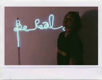
My name is Alicia Diego and I am a Design Student from Taylor's University, Malaysia. My hobbie includes cooking, crafting, painting, musics and listening to good talks like motivational, philosophical, or slam poem.
Being a student in the design school really involves a lot of creative & innovative thinking skills and an open minded mentality. Nevertheless, it is fun! especially if you love art as much as I do! Best and common advice, "Do what you love, and love what you do". Here are some of my favorite projects that I enjoyed doing and looking forward to do: |
|
Semester One | March 2016 | Two Dimensional Design Studies
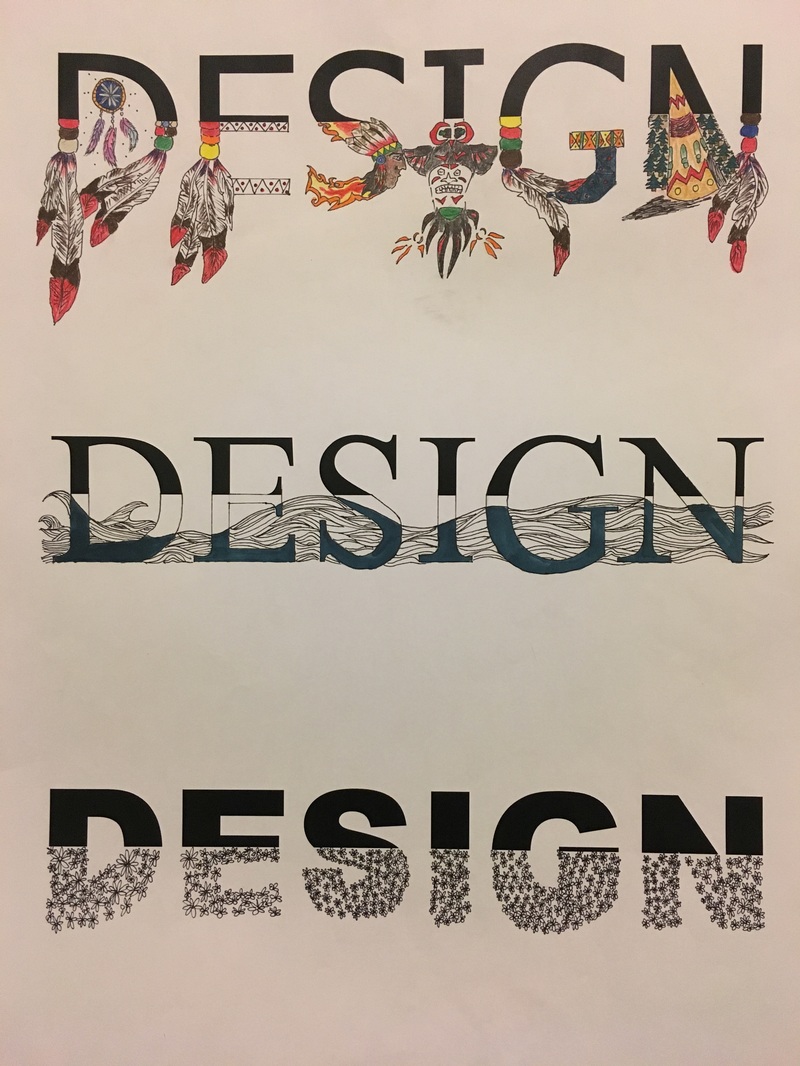
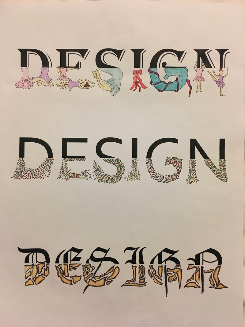
Designing "Design"
Basically Designing "Design" is part of the exercise for our Typography project. Half of the word (below) was cropped out. We were instructed to design the below-part of the word using any kinds of medium as long as it is in two dimensional.
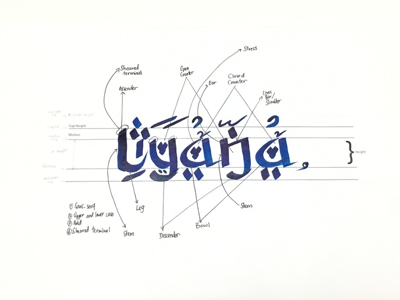
*Your Name* font
*Your name* font is actually a font that I designed for my middle and nickname, Liyana. This work is also part of our Typography project. For the design of the font, I was inspired by thr Arabian letters/words which are called Jawi. Since it was the month of Ramadhan al-Kareem, I thought "why not?". I love the Arabian letters, back when I was in primary school I took the Arabian language lesson. It's a bummer, I did not practice them. So from this name, it is a sans-serif, it has the uppercase for the letter "L", lowercase for the other letters, it is in "bold" and it has a "sheared terminal" on the top of every vertical stem. The dots, lines, and arabian symbols act as the decoration for the name to make it more dramatic and (in my opinion) beautiful. If you noticed, my letter "i" is not on the baseline. Therefore, the name now is spelled, "Lyana".
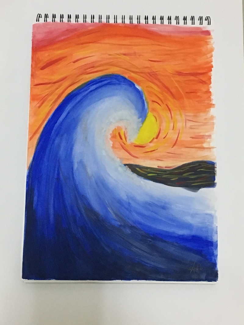
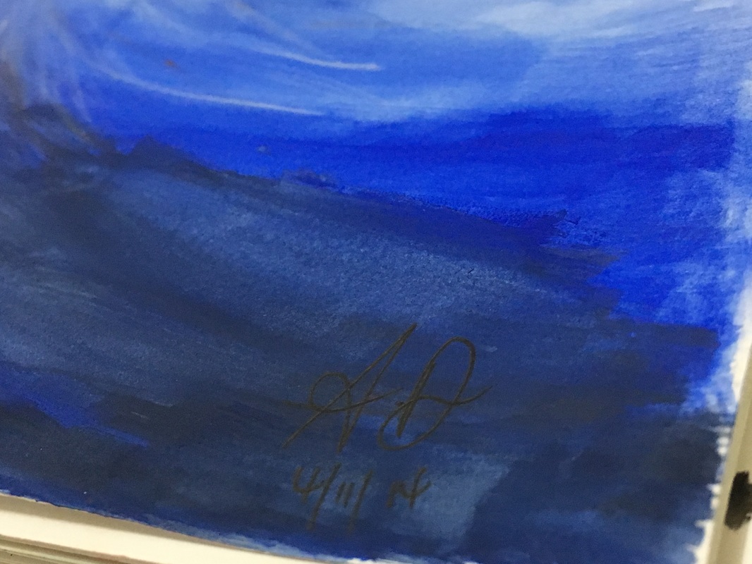
"The Big Wave"
"The Big Wave" is part of our Color Study project. I got the idea of the big wave and orange background since 2014. The medium that I mainly used was acrylics because it is suitable to paint onto the plastic. The Big Wave painting in 2014 was the reason why i started painting, being a teenage girl and going through high school was kind of tough but by art, it keeps me sane. Of course I only had like a normal cheap poster color, normal paint brushes, and a normal sketchbook but after I discharged all my emotions onto the normal sketchbook, I felt at ease, Satisfaction.
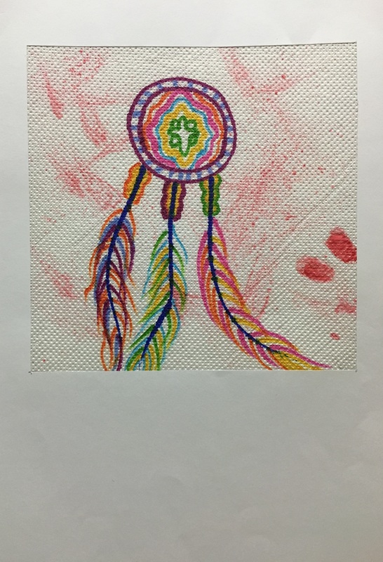
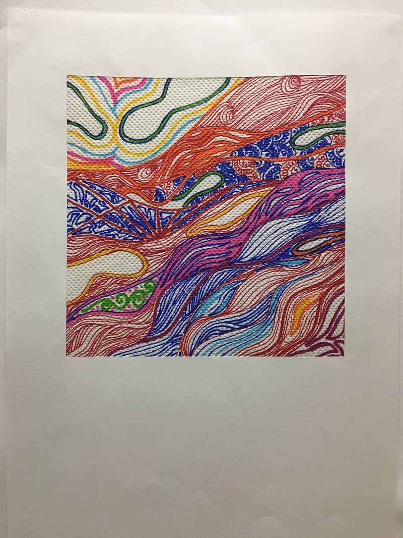
Paper Towel Design
There are two design on this part. The first one is called "Genocide" and the second one is called "Doodled". Genocide is dedicated to the innocent souls of Native Americans in the 1900's. Whereas Doodled was inspired by my old self and my habit when it comes to notes.
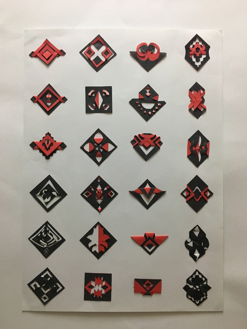
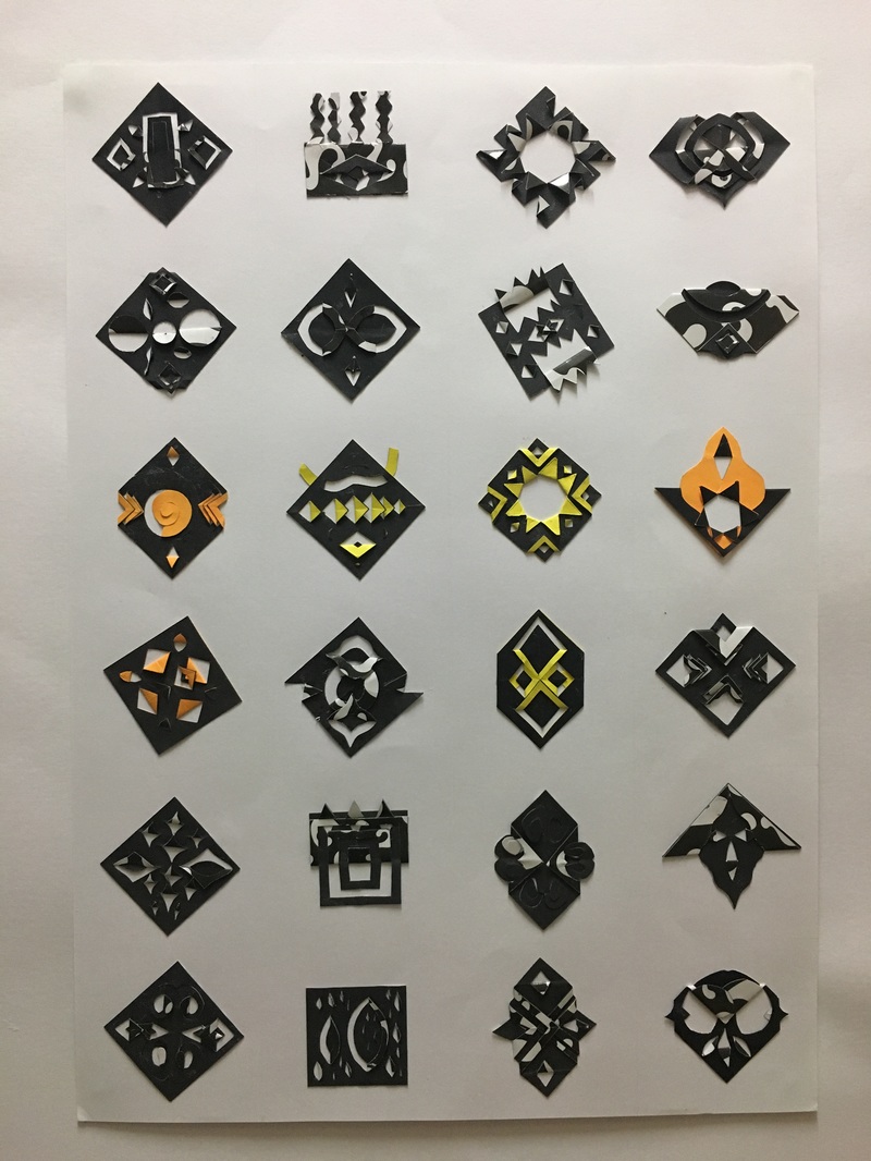
"48 Squares of Madness"
"48 Squares of Madness" is part one of our second assignment (Paper Cutting) It was really challenging for me because I had to brainstorm a lot of designs into that 48 tiny but mighty squares. It was a precice 4x4cm square and what we had to do was make a pattern by slicing the squares without tearing it apart. Those 48 squares really taught me to never underestimate the little things and it also taught me to explore my creative ideas and bring it to life. Anyway, what actually inspired me to do most of these design was from the stunning and modern architectural buildings. Also from flora and fauna, cultures and human beings.
Semester one | March 2016 | Creative Thinking Skills (CTS)
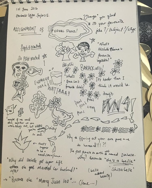
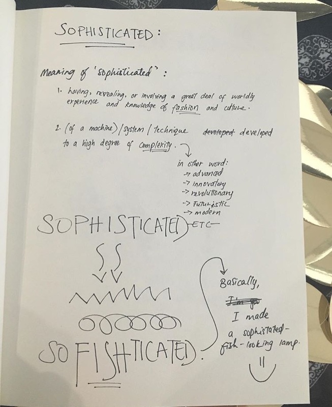
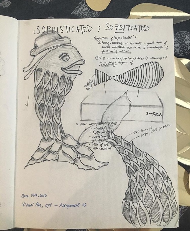
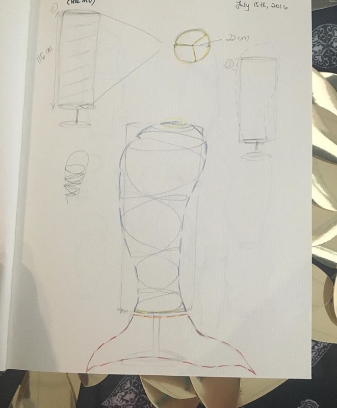
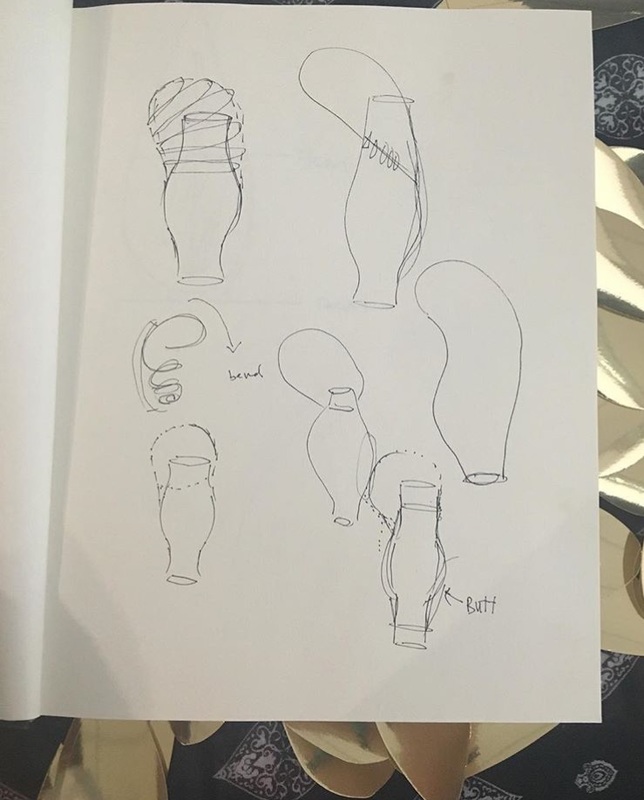
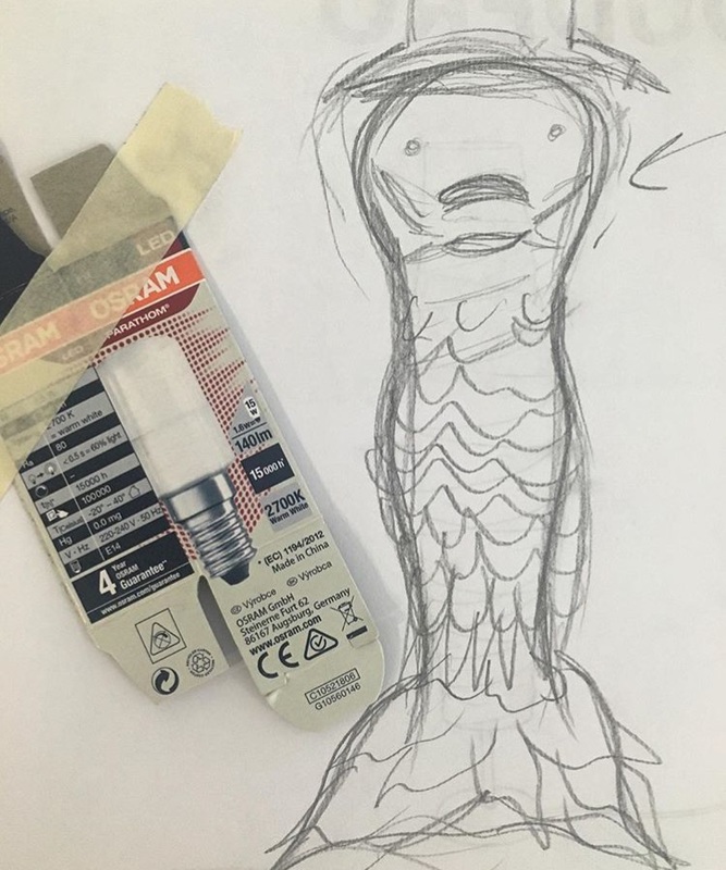
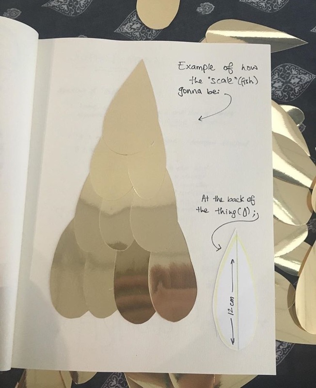
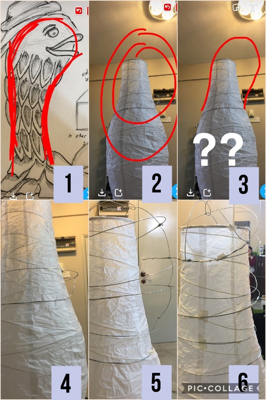
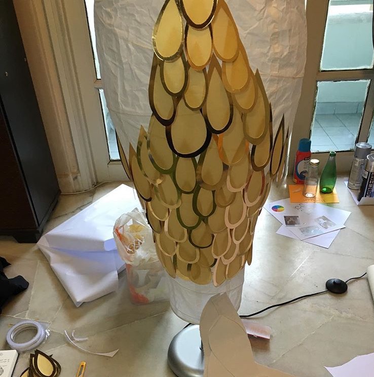
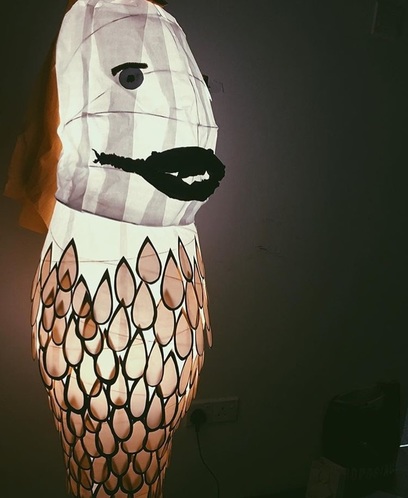
Visual Puns
Visual Puns was the final project for this module (CTS). The objective was to create a pun and make it into a sculpture. I chose "So-fish-ticated" (Sophisticated + Fish). A quite time consuming and challenging project to deal with because of the scales and the man-made head structure which I did it myself. The body of the fish was ready made, it is actually and standing lamp that I have in the apartment. While I was trying to figure out how to make my fish structure bigger, I stared at the lamp and then suddenly I decided to buy the same exact standing lamp in IKEA and start to build my Fish.
Semester two | September 2016 | Introduction to Photography
| photography_assignments_26.02.17.pdf |
Photo Shooting: Photojournalism // October 4th, 2016
- The task was to shoot 10 good photos of any interesting surrounding and has to be done manually and black & white
- It was held at Little India, Jalan Tengku Kelana, Klang from 12 noon till 4 p.m. .
My Photojournalism Experience;
The photo journalism task on October 4th has taught me so much more about my camera. I know how it suppose to work now, but with the Lumix GF2, I find it hard to set up the settings because of it's automatics. Especially when trying to adjust the shutter speed to capture a beautiful "car speed effect" without effecting the brightness. Therefore, I will work on that by practicing more often and researching which I will do after this. Nonetheless, the experience I had was beyond amazing and I hope to improve my shooting skills in the future.
Cafe Hopping Photographs
The task is to shoot 5 photographs of the interiors of cafes and 5 photographs of foods using DSLR (Lumix GF2)
Semester two | September 2016 | Introduction to Spatial Design
Exercise 1, Point and Line = Space
The Point and Line= Space is to identify the points/dots inside the three pictures taken; The book binder ( The Binder), the drain (Drainage) and one of the roof at Taylor's Lakeside (The Uncertaity of Ascendancy). The objective of this exercise is to get to know spaces around us throughpoints/dots and lines.
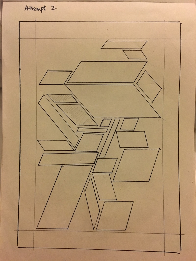
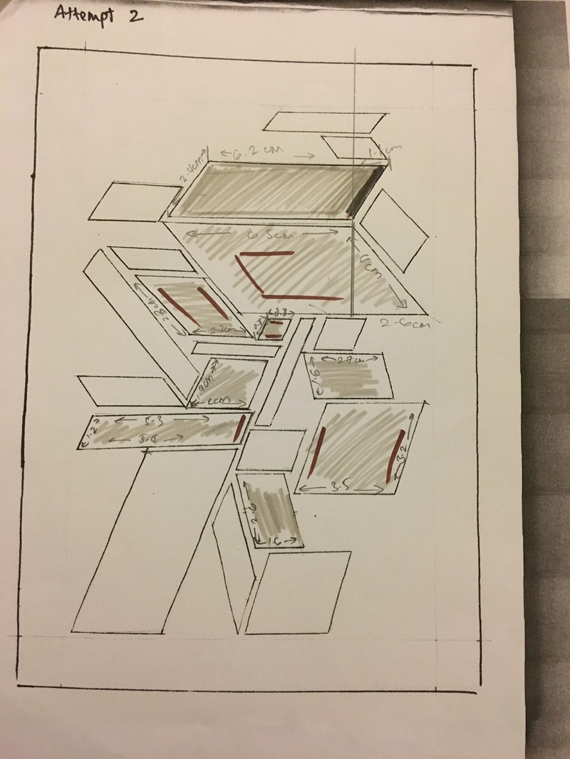
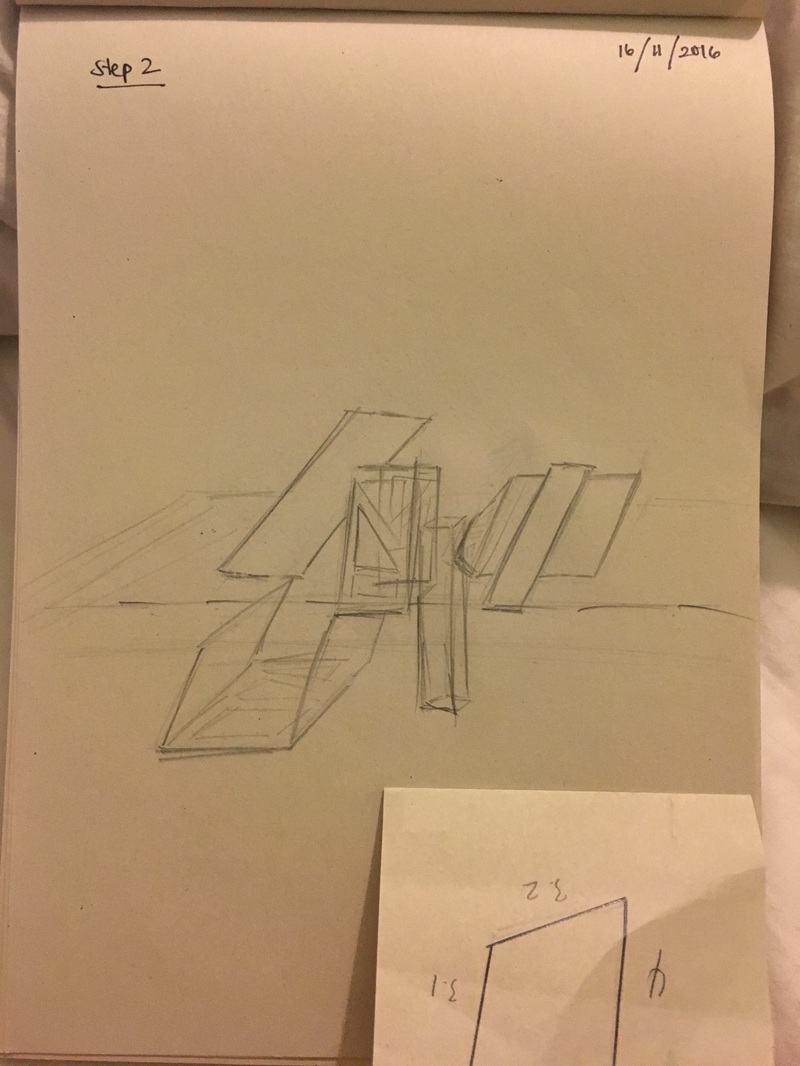
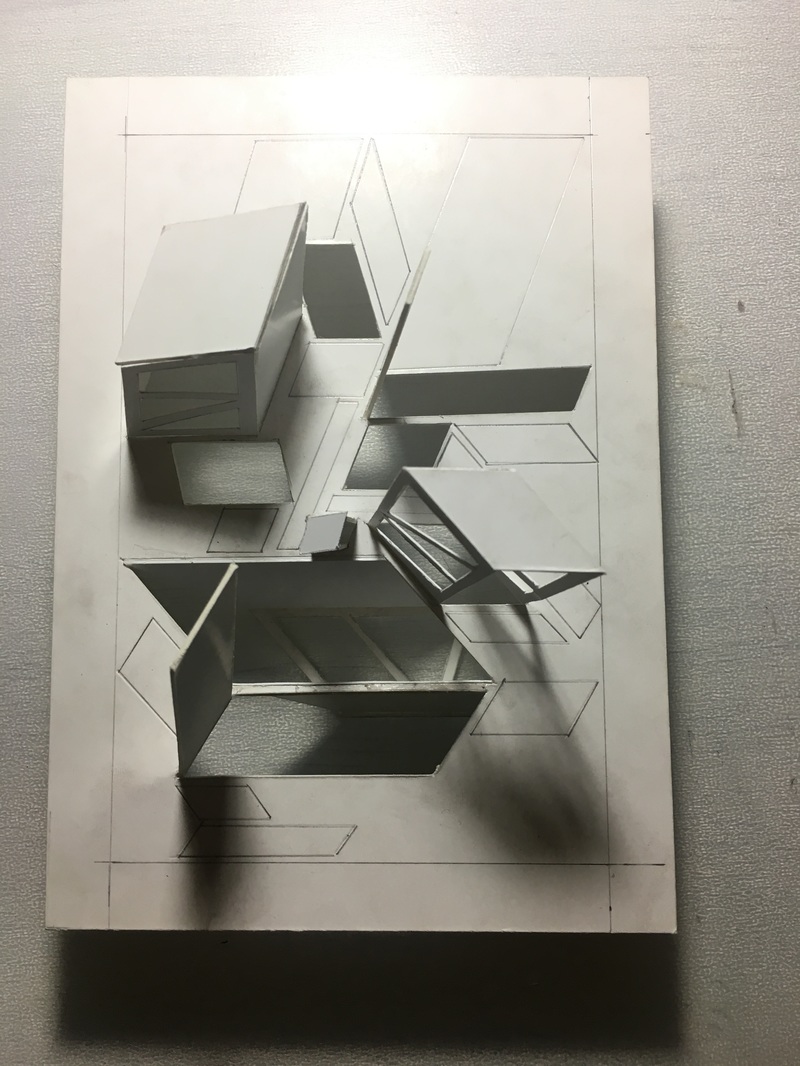
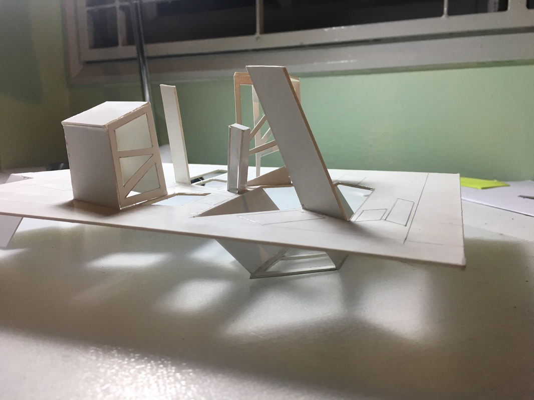
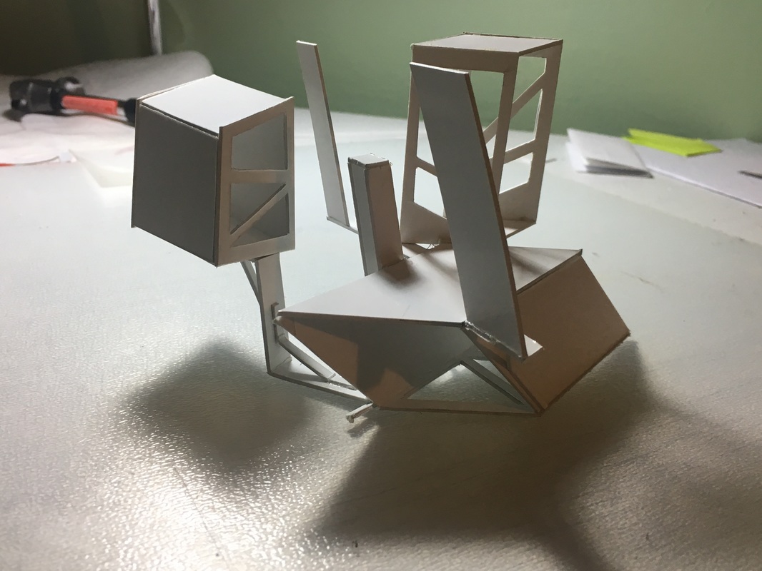
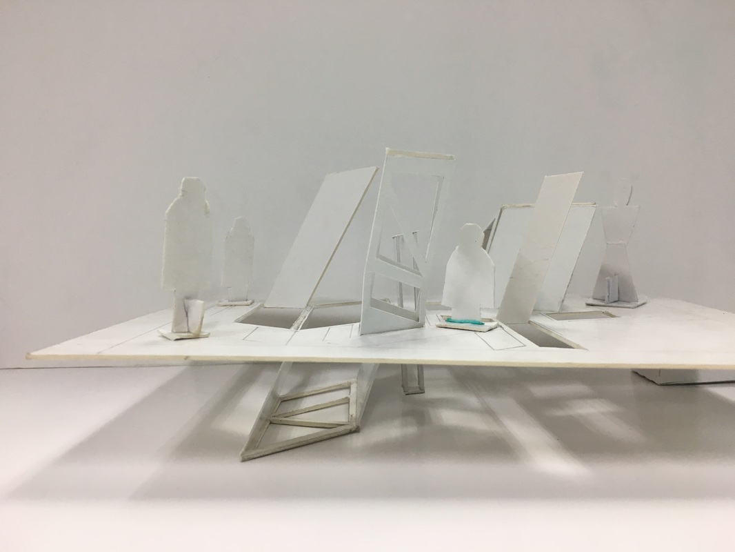
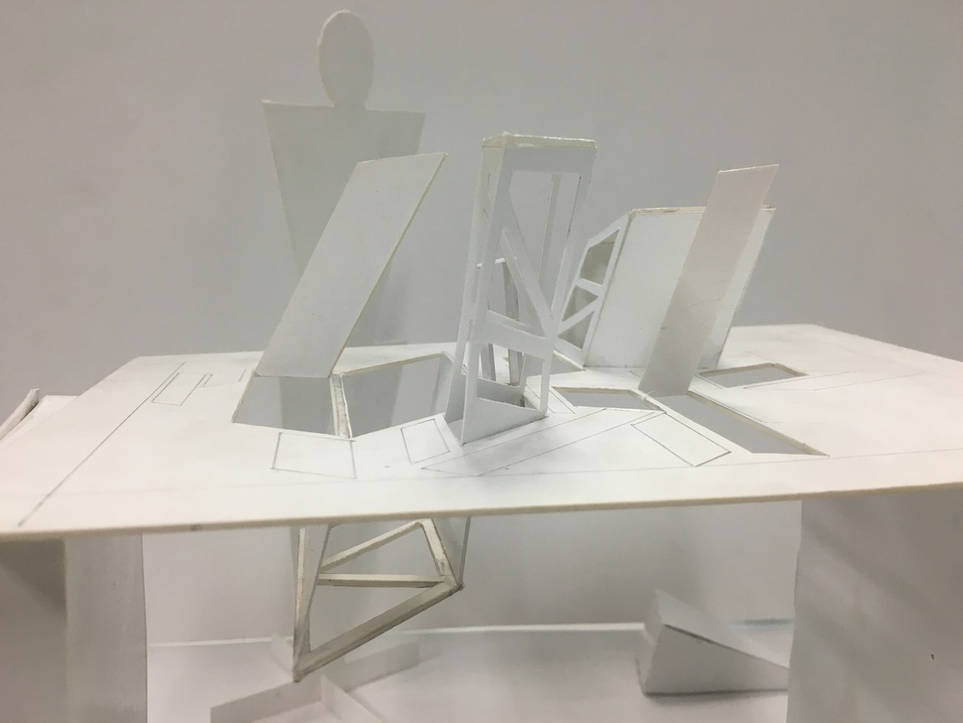
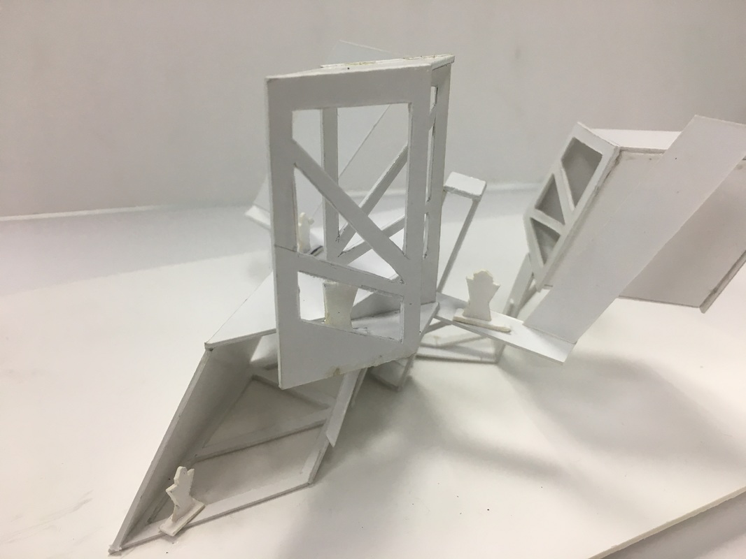
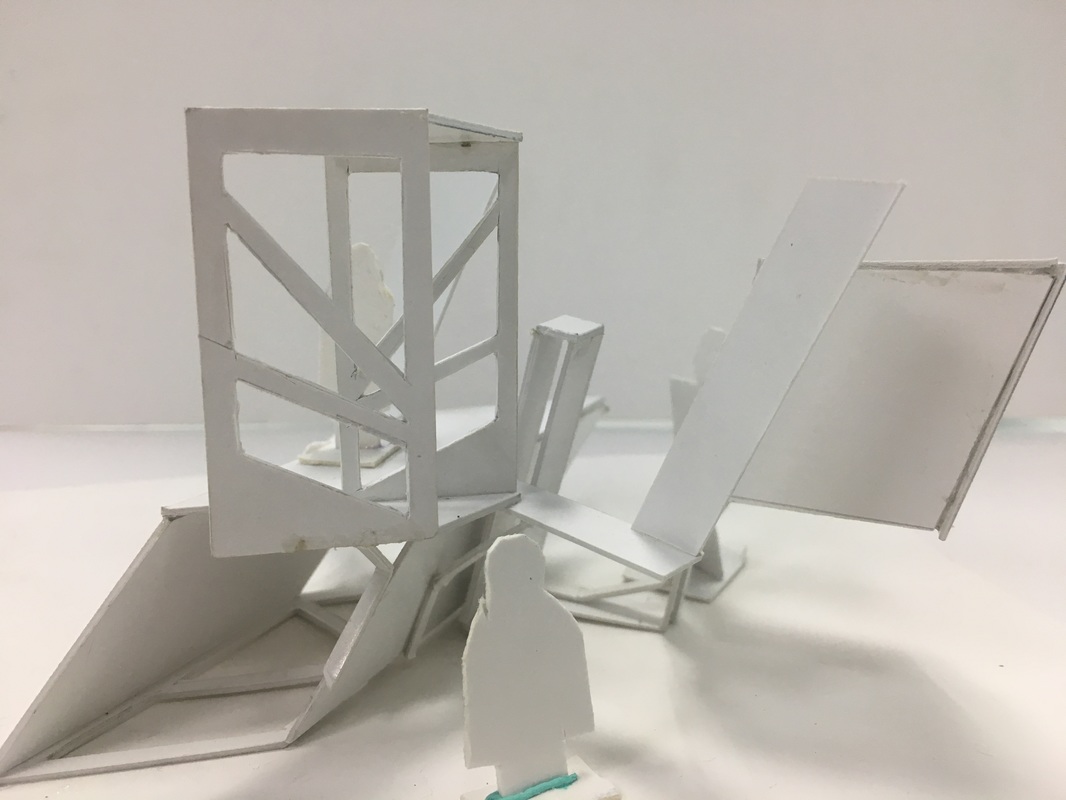
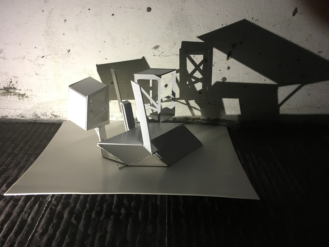
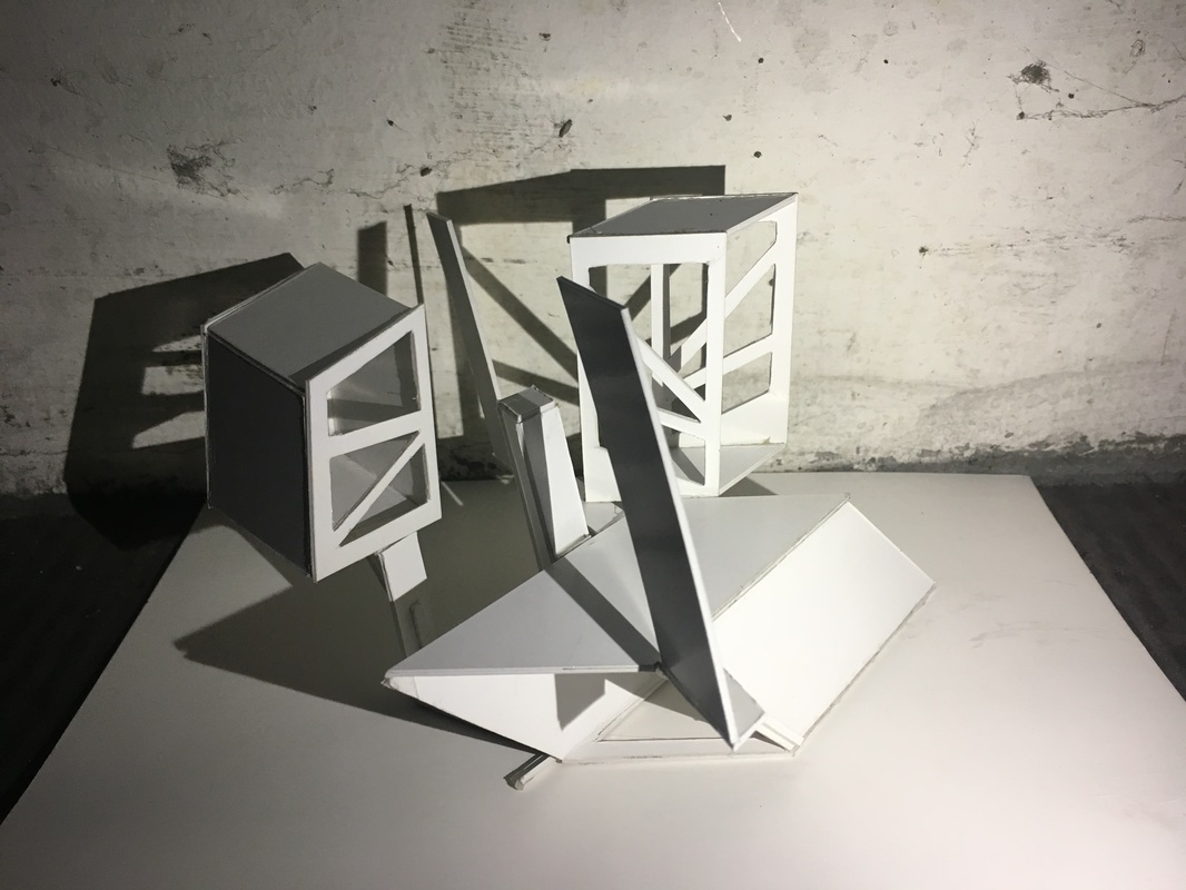
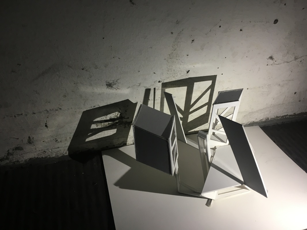
Exercise 2, Plane and Void= Space
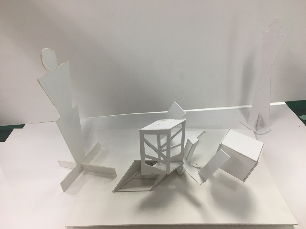
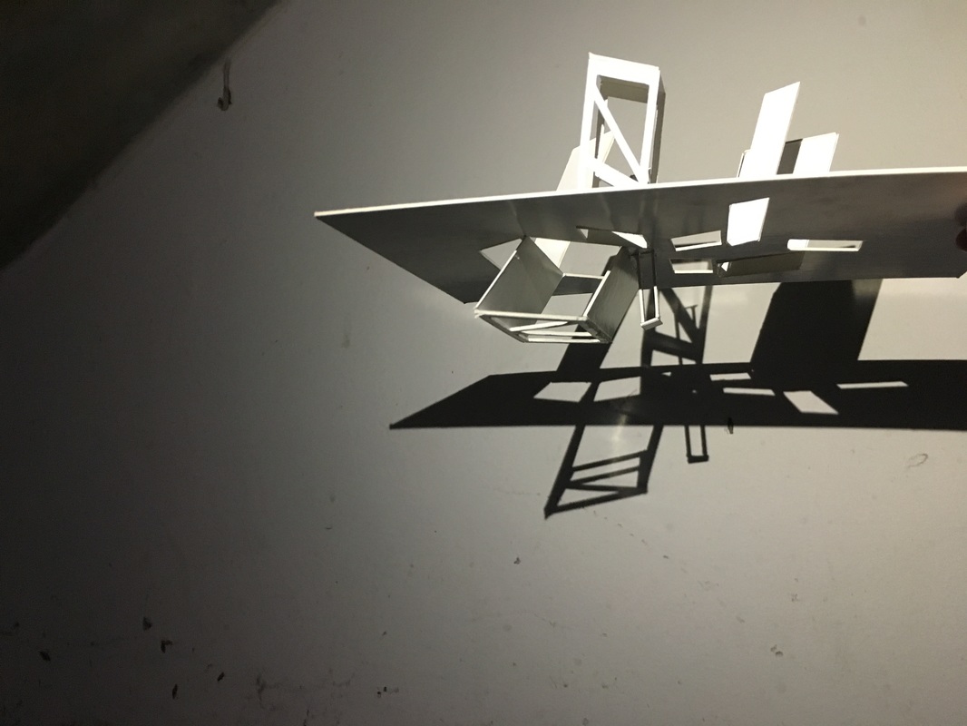
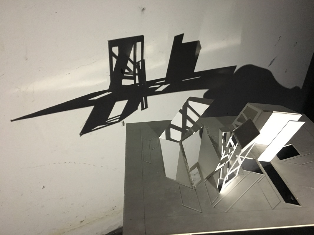
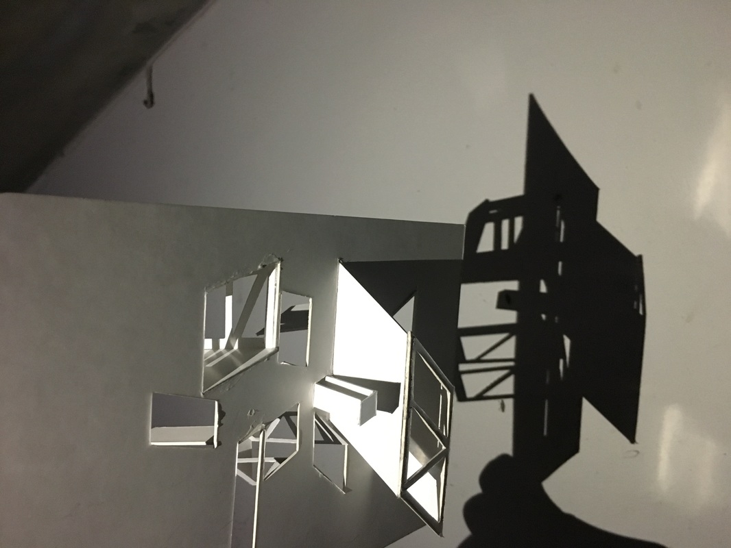
From this excercise, we were asked to create a design from a modeling card and to create a model that have space and void. The first three pictures of this document is part one of theh excercise. The design of Part one was inspired by the scale of a fish as seen on the corner of the board and the tail of a fish which can be seen in the center of the board. Part two of the design on the other hand, was inspired by a gate from the movie, Thor (2011) and Iron man's chest :)
Harmony and Light (On going project)
We basically started by decideing a geometrical shape and from that we created a repetition of the shape (in different sizes) on A5 sized board . The geometrical shape that I chose was a Paralellogram.
Human scale of the 2D/3D model
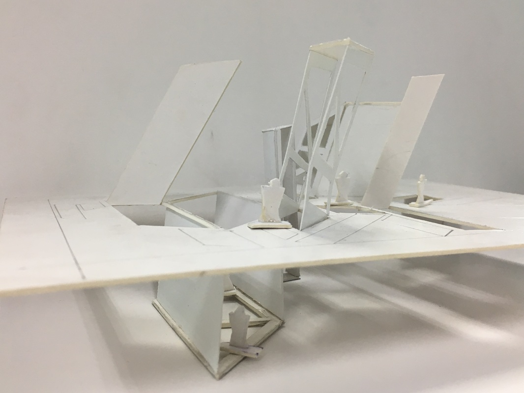
Human scale of the 3D model
Shade and shadows of my models
The next step would be building an actual model with textures and other fun stuff, but we are still working on it :)
Semester two | September 2016 | Contextual Studies
Assignment one
Basically assignment one is a reviewof a movie and how I relate it with reality and life. The movie that i reviewed is called "The Giver" it is a Fantasy/Drama film. "Jonas (Brenton Thwaites) lives in a seemingly idyllic world of conformity and contentment. When he begins to spend time with The Giver (Jeff Bridges), an old man who is the sole keeper of the community's memories, Jonas discovers the dangerous truths of his community's secret past. Armed with the power of knowledge, Jonas realizes that he must escape from their world to protect himself and those he loves -- a challenge no one has ever completed successfully. " - google
Here is the file to my review if you wish to read it.
Here is the file to my review if you wish to read it.
| thegiver__1_.pdf |
Assignment two
In this assignment, we were told to create our own summary/short story based on the movie genre that we have just reviewed and the goal is to do a summary with similar message from the movie that I have chosen. Here are my summaries. I wrote two summaries because from that, I can ask Mr Charles which one is better and choose the suitable, easy (not complicated), story line.
So, Mr Charles have read the two attempts and he chose "Attempt One" as it is more simpler, basic, straight to point summary. We had our tutorials on the 14th November, 2016 in the morning, before our next class (English II) start. Just a quick meet-up with Mr Charles to ask about our next step. Which is creating a Short Film/ a simple video of the summary! This is getting more complex, the end product of our video will be our final assignment/project, so the pressure is on. "If at first you don't succeed, live the rest of your life with your mom - JUST KIDDING, DON'T. - try, try again". When I heard "video", "film", "final assignment" I paused reality (daydream) and started sketching that curly-headed clown that is smiling but also crying. I don't even know why, but I think that is my subconscious self knowing that it is going to be a struggle. Anyhow, all I have to do know is create a simple storyboard of what I want for my video to look like and then shoot it. Oh and keep on saying positive words to keep me motivated and not panic. #FunFact I am a Gemini in personality but a Scorpion originally. It's weird but yes.
Assignment 3
(On going assignment)
*Assignment four will be the end product and final assignment for Contextual Studies*
This quite exciting- really exciting for me because I have decided on what type of video I should make! Before I start telling you the type of the video, Let me just explain the objectives; So, this video will be about technology. since technology became the life of our future mankind, it disconnects us to the nature life and more technology= more money, more money=paper, paper=trees. Basically I will try to convince my viewers to keep technology away for some time and start enjoy nature before it is too late.
The Poem ; Poem 1
*Note: Aria, the character in Attempt One Summary will narrate this story/poem. The second stanza is just a story for this project. It did not happen in real life. Also, this just a draft, some of the words are just temporary :)
I'm Curious ; Poem 2
Mr Charles and I have both decided to choose "I'm Curious" as the official poem. The video has already been submitted online. The video might not be the best one but I know I gave my best to this one. I noticed some imperfections to my video when it was compressed, so I might change that when I have the time to do so. Without further or due, please enjoy the video and have a nice day ahead of you! :)
